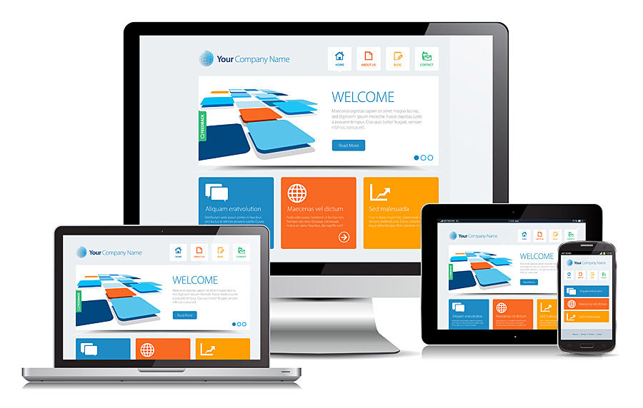
Wix Designing with Mobile in Mind
- Aug 7, 2019
- 3 min read
Updated: Sep 6, 2019
Desktop usage has fallen to 60% in the last 3 years, whilst mobile phone usage has increased to just under 40% and it won’t be long before mobile phone internet usage becomes the most popular way to surf the internet.
The Wix platform allows us to design our desktop website and once that has been perfected, we can then switch over to the mobile site to configure it there too.
The mobile site will include all of the design elements that you added during the design of your desktop site but should every element be used in the mobile site?
How can we best design our Wix desktop website with one eye on how it will look on mobile?
Wix have been clever in allowing us to hide elements in the mobile site which can help reduce clutter, but which elements should we lose? And what do we need to think about when designing the desktop?

Less is definitely more.
With such a small screen to play with minimalism is key when configuring our Wix mobile site so why not start with a minimalistic desktop site. In this day and age we all browse at speed so wouldn’t it be better to cut back on clutter and bring the focus back to what your site is trying to say/sell?
K.I.S.S. (Or keep it simple stupid)
Elements such as scrolling banners or swiping to the next page may not be obvious to the viewer so tell them how to use these elements with a small arrow or message. At the end of the day you really want to make it easy for your viewer to navigate your site and we all appreciate an easy to navigate mobile site.
Big Buttons
Navigating on a desktop website with a mouse and keyboard is very straightforward however the same elements on a mobile phones tiny screen, such as text links and buttons, need to be big and bold enough to be able to touch with a finger. With this in mind, you will need to consider how these elements look on the desktop site too as they cannot be altered in the mobile site.
Perfectly Formed Forms
Typing on a mobile phone is a laborious experience at the best of times so keeping contact forms as small and simple as possible really helps your user. Design forms with the least number of fields to be able to gather the data you need also, if applicable, use a visual calendar for a one click response instead of requiring the user to type in a full date. Top aligned labels are also easier on the eye for mobile users than the input field labels.
Image isn’t everything
Fact: We have a seven second attention span when browsing the internet (less than a goldfish!).
Speed then, is the primary priority when building and designing a Wix website. Fancy effects such as drop shadow and gradients not only look old fashioned, they also slow down the load speed of your pages. Work out if that image you have just added is really necessary and most importantly try to use images that are the same size as they are viewed by your visitor as highly constrained images will weigh the sites loading speed down hugely.
Conclusion.
Designing your Wix desktop website ought to be a fun experience and it can be tempting to add all manner of widgets that Wix have in their armory, but overloading your website with unnecessary elements can seriously affect the usability of both your desktop and mobile phone websites. Paring back your design and focusing on the content and what you are trying to convey to your viewer will make the user experience a pleasant one.


Comments